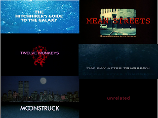
I posted earlier in the year about intertitles.tumblr.com, a blog which routinely posts a selection of title cards across a range of genres. This will be useful to us for deciding the sort of aesthetics we like, as will artofthetitle.com, a similar website that posts selected screenshots from the openings of films, including their title cards. In the post about Intitles I included a collage of titles I particularly liked, and this can be seen above.
 Titles that are of a similar style or genre to ours that are shown on Art of the Title include Fight Club, True Detective, and Casino Royale. These three title cards are punchy and relatively simple whislt still being relevant to the film and reflecting its style, which really ought to be a key point of an effective title.
 Our specific influences also can provide inspiration and influence us in our design, especially pink and blue colour schemed films like Only God Forgives, Hummingbird, and Welcome To The Punch. Although Only God Forgives is slightly further from what we would like to pursue than the other two, its colours and boldness can be learned from as an example. The Hummingbird and Welcome To The Punch titles are similar both to each other, and to what we would like to achieve. Both are bold, would serve us well in our dramatic title reveal, complete with sound boom, and have colours and fonts reflecting accurately the tone of the films they belong to.
CM


No comments:
Post a Comment