Monday, 15 December 2014
Movie Poster Research - Raiders of the Lost Ark

'The Return of the Great Adventure' is an interesting strapline as it both suggests a harkening back to an older style of cinema, where adventurers and goodies vs baddies was more common, but also a new spin on the style, which could appeal to both older and younger audience. The title is reminiscent of an old comic book title or of a Douglas Fairbanks Jr film, as well as being exciting and intriguing, which links back to the idea of a 'revisiting' of the adventure genre.
Harrison Ford, with his buttoned down shirt, active stance, raised weapon, and Eastwood-esque headgear, is the classic adventure hero, fending off the heinous nazis with one hand back to protect both the story's heroine, and the Ark. The tone of the poster is thrilling and action packed with a lot to take in, whilst still retaining an emphasis on the characters and features of the film itself. The nazis are all straight-faced and solemn, a sense of formality surrounding them and contrasting with the not-altogether-groomed look that Ford is sporting, clearly painting him as the anarchic and free thinking hero to battle the authoritarian nazi antagonists. The tone of the poster is compliant as such, with a playful and fun spirit behind it that is combined with the thrilling and active imagery of adventure.
There is reference to the older genre of adventure films in the poster, and many of its hallmarks are drawn on. Obviously nazi and obviously middle eastern figures appear, a feature of the more conservative nature of earlier Hollywood cinema, and the poster's style of art and arrangement is distinctly evocative of film posters of that era.
The film is obviously directed at a younger male audience, with the poster featuring stereotypical 'hero' and 'damsel' figures, and presenting a sense of morality that is simpler and more 'black and white'. The attractive female and aspirational male are obviously directed at a certain gender. In terms of age, the genre would traditionally appeal to younger consumers, although there is an attempt to be more 'catch all' in the revisiting of an older genre and the angle that that is directed in.
In terms of representation, all but one of the figures appearing on the poster are men, all but two are white, and all but three are white men. The woman is in a submissive, frightened pose that depicts her as the 'damsel' figure who needs protecting by the manly Ford. The two middle eastern men on the poster are not central to the plot particularly and can thus be viewed as having been put in the poster as 'curiosities' to make the film seem more exotic or adventurous. This, paired with the depiction of the evil nazi German antagonists could give an air of xenophobia to the poster.
The poster is very effective at conveying genre and character through colours, figures, and imagery. It draws in a wide audience with promises of excitement and adventure whilst remaining a sophisticated and eye catching piece of advertising.
CM

Movie Poster Research - The Godfather

The anchorage of this poster of "The Godfather" is of major importance for a first time viewer of the film. Without it, one would imagine a comic book, possibly of Marvel's darker section with the black and red dominating the poster. With the text however one realises that the poster actually represents a film, shown through "Paramount Pictures Presents" which not only shows the poster as advertising a film but also attempts to entice fans of the production company Paramount to see the film. There are also connotations in the text of the poster, with "The" godfather suggesting an unparalleled power, and a godfather which everyone knows about. The word "Godfather" itself has previous Mafia links and is reflected in the film, however it also suggests a link between the viewer and the Godfather, enticing the reader further. Finally, the font of the poster title seems expressionistic yet clean, again reflecting the contents of the film.
The tone of the poster, and in turn film, is a dark one. With the dominating colour being black there is a negative and sinister tone suggested through the colour scheme. There are also suggestions of conflict and blood through the blood red colour of the dominant figure in centre shot. There are also levels of formality which are implied through the poster, as previously mentioned the use of "The" instead of "A" or an alternate phrase suggests a familiarity and power which is unrivalled. Through the facial expression and positioning of the man in centre shot, we can also see that the poster takes a dejected, solemn tone which again is reflected in the colour scheme.
There are no intertextual references as such, however the "Paramount Pictures Presents" takes part of the viewers focus away from the poster and to the production company. This becomes more and more important in the two sequels of The Godfather as it links them to the previous films through title and production company.
The target audience of the poster is relatively obvious. The dark, sinister use of black and red with the film being an 18 itself closes the target audience off from the bottom end of the most typical film market (15-24) and opens the film up to more adults, suggesting a maturity about the film and connoting themes which only the elder generations can understand. It is also directed at a primarily male audience, with the person in the position of power in both the title and poster being a man. It also sells itself to a fan of good film, with a minimal poster suggesting the majority of the marketing to be done in hype around the film itself.
There are no obvious ideologies in the poster, simply due to the lack of character definition in the poster and the null colours. Through knowing the film, one can suggest that through the lack of vibrancy and emotion in the poster the gang/mob life is looked down upon as not always coming out on top, which is slightly emphasised through the facial expression of the man on the poster.
JL

Movie Poster Research - Sin City: A Dame To Kill For
 Varying aspects of the poster for "Sin City; A Dame to Kill For" pose many questions as to the connotations of the film as a whole, as well as the poster. The lack of colour, not only typical of the previous instalment of Sin City, also draws contrast between the black and white figure of Mickey Rourke in centre shot. The contrast can suggest a variety things, some of which include good VS evil, old VS new and the abundance of the two opposites of the colour range suggests conflict. It is commonly perceived that an excess of white can be viewed as cold, harsh and isolating which is emphasised through the implied danger of the gun and remoteness of Mickey Rourke. Barely visible is a necklace holding a cross around his neck, which bears implications of religion, hope, and forgiveness even when juxtaposed with the dismal, apocalyptic feel of the black white and red poster, showing rain in the background and Rourke's menacing figure in the foreground.
The anchorage of the poster, although minimal, has a great effect on the viewers understanding of the poster. With the sequels title, "A Dame to Kill For", it not only gives purpose to the isolated, strengthened looking character who dominates the poster but also suggests varying characteristics associated with him. Although portraying him as violent, it also suggests a passion, with both characteristics being highlighted through the use of red in the text alone. Without the text, one would imagine a comic of some sort set late into the 20th century, however with the text we realise not only is it set much later than imagined but it is also a film, Frank Millers attempt to out do his previously acclaimed film.
The tone of the film, portrayed through the poster, is obvious. With the comic book style of the cover combined with the knowledge that this is Frank Millers Sin City sequel, one can tell that the tone will be desolate, isolated and violent, possibly taking the same bleak and apocalyptic colour scheme of the first film in order to create a similar atmosphere. With the majority of interaction between humans being non-verbal, the image paints a vivid picture of what the audience is to expect from the film, with the baggy leather coat, low cut shirt and hefty shotgun slung over one arm painting a sinister and action filled picture. The register of the poster is also important, with the specific use of the word "Dame" instead of woman, girl, wife or any of the other options which could have been used. Being the female equivalent of a knighthood, a sense of importance is portrayed, which is reiterated through her being distinguished from other Dames as "To Die For".
There is one intertextual reference, with "Frank Miller's" being placed above the title, linking it to the previous Sin City Film. This has the effect of drawing in an audience which enjoyed the first film, which is a large proportion of action film fanatics due to it being considered one of the best action films of all time. The accompanying poster to the previously shown features Jessica Alba, boasting a high valued cast and implied sexuality on top of a previously standing legacy. This increases the target audience from action fans to fans of Mickey Rourke, Jessica Alba, and star studded line ups featuring both old and new stars. Appealing to mainly a young audience, the use of Rourke, Willis and Liotta also appeals to the elder, traditional action/adventure fans.
The poster displayed is very effective. Whether this is because I am the target audience, or because of the poster its self, it makes me intrigued to watch the film as not only a Sin City/Frank Miller fan but also an appreciator of good film. Maintaining the comic book style of the previous posters and expanding on them in the new film has kept the films previous reputation while inducing new audiences who would not have been previously interested.
JL

Movie Poster Research - Road To Perdition
Connotation - The visual image of the father and son wearing similar clothes and holding hands connotes this idea of a family bond, which is central to the main theme of the film itself. Tom Hanks holding the Gun and the shadow covering half of his face suggest something different and create mystery around the poster. This links into the Film Noir style that the poster is clearly trying to connote. The rain splattering across the poster also creates a powerful image. You can almost hear the rain, which connotes the idea of the family bond as aforementioned being broken, which is a major part of the film, due to the fact that the son witnesses what his father (Tom Hanks) does for a living. The film noir style of this poster is certainly shown through all the visual images presented to the audience. (shadowy image of Tom Hanks character and his son with the street lights in the background).
Anchorage - The Anchorage, despite being minimal in terms of actual text on the poster, it is certainly effective in that it almost gives reason to the picture of Tom Hank's character and his son. "Pray for Michael Sullivan" suggests that Tom Hank's character will experience many problems throughout the trailer and with the words placed above the 'Tommy Gun' again suggest that the problems he will face will be particularly dangerous. The Bold Gold text spelling out "Road To Perdition" also heightens the situation, which is clearly shown through the image in the background. It gives a sense of importance to the two characters on the poster and almost forces the audience to notice the bankable actors names just above the title of the film.
Tone and Register - The tone on this poster is certainly quite dark and mysterious as shown by the Film Noir style. The long coat and trilby hat working in collaboration with chiaroscuro effects undoubtedly create a mysterious tone and link with one of the major themes of the film itself, Betrayal. The Dark tone is accentuated by the shadow image of the Gun in the bottom left hand corner and the rain splattering across the poster. They work well to create a moody atmosphere and link in with the text as aforementioned.
Intertextual References - "from the director of American Beauty" - This informs the audience on the style of film they are looking at and might create a wider audience as fans of that particular director might want to see the film for this reason. The institutions are also placed on the poster to again attract the audience to see the film as they would recognise the companies producing and distributing the film.
Target Audience - The target audience for this film is certainly focused on the larger male audience. This is because Tom Hank's character is clearly a father figure, which would attract a male audience. Also, it is clearly a gangster style movie as clearly shown by the 'tommy gun', which again would be seen to please the male audience more. However, the theme of family values as shown by the two characters holding hands, could attract a female audience. Woman may also be attracted to watch the film by the names of some of the stars featuring in the film, such as Jude Law. However, the film is clearly aimed at a larger male audience.
Representation - The dangerous world of gangsters is clearly represented through the dark imagery of the father holding hands with his child whilst holding a 'tommy gun' in his other hand. This could represent the fact that once someone has become involved in that lifestyle, then everyone around you becomes affected, even your children. It's particularly powerful as the innocent image of the child, who appears to be dressed in a similar way to his father, has been caught up in the dangerous lifestyle of his father. The fact that you cannot see the boys face is also powerful as it represents this image of a loss of hope, which is counter-acted by the shining lights in the background of the image.
Effect and Effectiveness - This poster is undoubtedly effective as clearly shows the major themes f the film itself, which are Family Values and Betrayal (Shown by holding hands and Gun, coupled with film noir style and the rain). The anchorage is also effective as it enforces the themes of the movie, by implying that Tom Hank's character and his son are on their own in the movie and have little help from the people around them.

MT
Movie Poster Research - The Conjuring

Anchorage - "Based on the true case files of the Warrens" - This certainly effects the way the poster is viewed as an audience member and is often used in Horror Movies to attract the audience and cause them to feel more scared of the events in the film itself. This causes the audience to be more likely to believe the events in the film and thus feel terrified when watching it. It is important to put this on the film poster itself as it will attract more people to watch the film at the cinema when it is released. "If it is based on a true story, the film instantly becomes more scary" - This is the idea behind why this line is placed on the movie poster.
Tone and Register - The tone of the poster is clearly one of death and decay as shown by the shrivelled tree and the old wooden built house in the background. You know straight away that this is a poster promoting a horror movie due to the dark undertone, as shown by the central hanging rope representing death.
Intertextual references - "From the Director of Saw and Insidious" - lets the audience know what type of film they are likely to be going to see as they can base their opinions on these previous films mentioned. This certainly attracts the audience to watch a certain film, because if they enjoyed either, 'Saw or Insidious', then they are more likely visit the cinema and watch the film. The institutions are also referenced, which is also important as the audience will familiarise themselves with these well known institutions and perhaps be more likely to go and watch the film.
Representation - the poster clearly plays on the stereotypes of most horror movies, with the large bedraggled house in the background representing this idea of a haunted house and a family being haunted by an unknown presence as represented through the image of a shadowed figure in the foreground of the poster. Despite the clear representation of death on the movie poster, the small glimmer of light appearing over the top of the house could be seen to represent this idea of hope and that good will prevail.
Effect and Effectiveness - This movie poster is undoubtedly successful in getting across the genre of film through the images it presents the audience with. It is evident that it is a poster promoting a horror movie almost as soon as you glance at it, due to the choice of images (large house, rope, tree) and the dark, almost gloomy colour chosen for the background. The poster could possibly be more successful if their was a phrase or line inserted to attract the audience to think in more depth about the poster and in turn create a wider audience for the film. However, in terms of attracting an audience, this poster is certainly effective as it attracted me to want to travel to watch the film.
MT
Friday, 12 December 2014
Filming Schedule
This is the schedule for our filming dates coming up due to the fact that we want to complete all of our filming over the christmas/winter break in order to leave ourselves with enough time to complete the editing as well as get underway with our ancillary tasks (poster & magazine cover). We felt it was necessary to plan our time ahead in order to keep on top of things over the holidays, whereby daily contact is not as easy.
Filming Schedule:

Following deliberations regarding our casting decisions, we have decided to use our secondary actors (Georgie Ward and Joe Rose) for the female and secondary antagonist characters in our trailer.
Filming Schedule:
MT
Thursday, 11 December 2014
Little White Lies: Institutional Analysis
The publisher of the magazine Little White Lies is TCOLondon. This is a company which specialises in slightly off the wall, individual and quirky takes on stories which would not usually get views, or angles on films which are not usually assessed. The very branding of the website (www.TCOLondon.com) as shown below differentiates itself from other forms of media by defining itself as a breed, something which is lifelike and ever evolving. From work in skateboarding, phone companies, games consoles, and sponsoring YouTubers, their list of partners ranges from Grolsch to Audi. This shows where the inspiration for Little White Lies comes from, as well as why the company decided to back such an out-there product. Even within their distribution, with Little White Lies originality being an online-only magazine, they establish themselves against the norm and through this use of technology cater to a specific audience.

This audience is that of 18-30 year olds who are either young professionals in or students of media. They must have significant disposable income because of the monthly subscription of £3.95 for a product which, looking past its potential as a collectable and art, provides less than a week of entertainment. This suggests than that like Empire and Sight&Sound, that the demographic for the company is ABC1 and massively involved with South East London promotions. This is done in the Barbican, BFI and Picturehouse cinemas' and film festivals which caters to the sort of indie film buff audience with disposable income. The benefits of this are found within independent and cult cinema fans who would rather discuss films as an art form rather than just passive entertainment. The magazine caters to independent critics and in depth interviews with cast, directors and producers in order to help their readers form opinions upon the films they cover.

The magazine, along with others' of its type, use mosaic geodemographics in order to establish the type of person their product is going to cater towards. An audience segmentation can be found below. This shows that the majority of the audience is found within London based Hipsters which falls under the magazines demographic of Group O buyers, standing for Urban Intelligence that 'Mostly consists of young and well educated people who are open to new ideas and influences'. It also caters to audiences such as Group E, young people who have gone through higher education and can be liberal of idea, and have access to disposable income. It caters to this audience through claiming to be about truth which connotes authenticity. Because of this, the more niche audiences of Arthouse film fans and Aspiring filmmakers are also catered towards, while more mainstream film fans and design students are left to read magazines like Empire and Total Film.

The purpose of the magazine fits with the publisher's slightly independent style of reporting. Even from the weight of the paper the magazine feels like a substantial product, filling a gap in the market for collectors items concerning film, which is then corroborated through the hand drawn/graphically modified artistic style of the covers (Of which they employ independent designers) and the typography of the front cover. The choice of film is also essential as to its purpose, and in turn the sorts of audience which are going to read it. Taking up yet another niche gap in the market, focusing on films such as "Black Swan" and "Let The Right One In", they decipher films which are not only in between the mainstream and indie genre but also those which are going to obtain a cult following. Due to this, in combination with the subtle yet aesthetically pleasing cover which screams that the magazine producers know their movies, the magazines' purpose is to fill a gap in the market between Empire's mainstream coverage and Sight & Sound's more individual movie coverage through an artistic and bold cover, substantial page thickness and quality which would leave you wanting to show your collection off to your friends.

JL
Tuesday, 9 December 2014
Camera Practice
We have now had a chance to refresh our camerawork and sound skills following the summer holidays and first term of relative indolence in practical skills. This post is in order to look at and evaluate the composition and effectiveness of some of the shots we took.

This first shot uses perspective well, and used the correct angle for filming the hallway, keeping the foregrounded figure (Max) central to the shot and the action just to his right. I would say that this shot is one of the more well composed we took.

This shot is less effective in my opinion. The idea was to get a low angle shot making Max look more formidable and dominant. We were unable to get the camera low enough and as such the shot suffered, becoming fairly ineffective in its aim.The intended symmetry of the shot is also off, adding to its general air of failure.

This shot has strengths and weaknesses. It is well lit and shot interestingly, keeping the figures central and the background chairs as a feature. However the shot appears to be slightly off kilter, distracting from the better areas of the shot, something that ought to be rectified in any shot that goes into the actual trailer.
CM
JL
Thursday, 4 December 2014


Empire: The Bourne Legacy
This is a piece of analysis on one of 'Empire Magazines' front covers completed using the Photoshop software on the Mac:

MT
Tuesday, 2 December 2014
Animatic
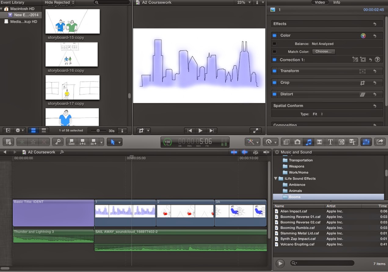
We have been using Final Cut Pro over the past few days in order to produce our animatic. It has certainly been helpful to use Final Cut again after last years AS task and it has been useful playing around with the length of shots and sound in our animatic because it has prepared us for the final editing task. As seen in the screen-grab below we have been playing around with the effects (crop/transform/color) in order to familiarise ourselves with the workings of final cut once more and improve the quality of our animatic. We also experienced a problem with the colouring of this character below so, as you can see we exported the 'still' back to photoshop, changed the colouring and then imported it back into Final Cut. We then hid the initial clip and placed the new one below in order to keep the sound timing the same. This was important because we didn't have one continuous soundtrack throughout it would have been hard to re-adjust the sound back to levels we preferred it.
As you can see above ^^^^^, we were adding a few of the stills from our storyboard (4 pictures on the left) to our animatic and were playing around with length time for each shot.

^^^^^^^^
We decided to play around with the different sounds available at this point as seen above (explosion 5 & booming rumble). We wanted to create a 'sound boom' effect at this point and so decided to sample a few different sound effects until we came across 'Booming Rumble', which was the closest towards the sound boom we could possibly find. We also played around with the sound fading up and down at the end/start of each section of sound in order to improve the quality of the sound boom.

^^^^^
We again decided to use 'Booming Rumble' because it sounded extremely similar to the 'Sound Boom' effect we see in most of our film influences.

From our shot list, we each took an act and drew out a story, Joe drawing Act 1, Max Act 2, and me Act 3. We cut out and coloured these drawings using Photoshop, and input them into Final Cut Pro in order to create an animatic to give us a better visualisation of what our film will end up looking like. We edited our own acts and tried to sync the music and sound effects as best we could, and I think the animatic gives a good idea of the pace and tone of our film, especially in the montage.
The audience feedback we received on this animatic confirmed most of what we thought about it, though there were some concerns expressed about the clearness of the narrative - though this is something that will naturally get better when we use actors and cameras, and is certainly something we are keeping a close eye on. It was suggested that the characters and story were fairly generic, though this is something that we can rectify with stylistic features, camerawork, and real people.
CM
MT
Sound Test
We spent some lesson time recently working on our technical skills regarding the use of sound. The other two used the boom mic, boom pole, micro track, and directional mic in order to try and make sure our sound for the trailer was as good as it could be, whilst I operated the camera. The mic on the camera captured one set of sound on our trailer, and the boom mic with wind protector captured a better quality one. I then used Final Cut Pro to detach the camera sound and insert the mic sound to enhance the scene.
Here is the initial take:
We can compare this to the better quality of sound we were able to achieve with the mic and our editing skills, giving us a good idea of the techniques to use in our trailer:
CM
Here is the initial take:
We can compare this to the better quality of sound we were able to achieve with the mic and our editing skills, giving us a good idea of the techniques to use in our trailer:
CM
Saturday, 29 November 2014
Storyboarding
After completing the shot list we decided to draw up a storyboard in order to visualise the different shots we were going do and thus be able to view the trailer as a whole in a more adaptable way. We would like to turn the pictures into a moving animatic, whereby we can almost see the full trailer in it's simplest form. We split the three acts between the three of us and have now returned after half-term with all of the pictures drawn up ready to fit them together as an animatic.
After drawing the pictures for our storyboard from hand, we exported them into photoshop in order to add colour to the pictures. We wanted to do this in order to make the images more clear, but also for us when it comes to the filming stage as we can easily identify, which characters are in which scenes along with the help of our shot list. The colour not only improves the overall quality of the storyboard photos but provides us and early viewers with a clearer view of how our film will eventually look like.
This part of the process was particularly useful for me as I was relatively inexperienced with using photoshop and it was a good way for me to get to grips with the workings of the programme before we moved into the graphics/research stage. Due to the fact that I was heavily involved in the credits & Ident research, being able to use photoshop was particularly helpful as we could sample a few ideas before finalising them.


Above are just a few of the many storyboard images we altered and then coloured in using photoshop. I found it particularly difficult to get to grips with the different layering involved on photoshop but am now much more confident when using it.
-

Although sub-par, the below shows how we have utilised colour and a mixture of photoshop and drawing to create the images for our story board. Through the use of colour we are not only able to differentiate between our characters but also show the tone the film will take, with the prominent light and dark blue lighting being something we have wished to emulate since the start of our project, taken from such aforementioned films as Welcome to The Punch and The Dark Knight Rises. As well as using technology to colour we have also utilised google images in order to provide us with sections to our images, such as the world map in the centre-right shot and the face which the photo frames in the bottom right hand shot. By doing this we are better able to visualise the look of our trailer, meaning that when it comes to the day of filming we are better prepared to find the exact correct lighting and locations.

MT
JL
Subscribe to:
Posts (Atom)