Saturday 29 November 2014

Storyboarding

After completing the shot list we decided to draw up a storyboard in order to visualise the different shots we were going do and thus be able to view the trailer as a whole in a more adaptable way. We would like to turn the pictures into a moving animatic, whereby we can almost see the full trailer in it's simplest form. We split the three acts between the three of us and have now returned after half-term with all of the pictures drawn up ready to fit them together as an animatic.

After drawing the pictures for our storyboard from hand, we exported them into photoshop in order to add colour to the pictures. We wanted to do this in order to make the images more clear, but also for us when it comes to the filming stage as we can easily identify, which characters are in which scenes along with the help of our shot list. The colour not only improves the overall quality of the storyboard photos but provides us and early viewers with a clearer view of how our film will eventually look like. 


This part of the process was particularly useful for me as I was relatively inexperienced with using photoshop and it was a good way for me to get to grips with the workings of the programme before we moved into the graphics/research stage. Due to the fact that I was heavily involved in the credits & Ident research, being able to use photoshop was particularly helpful as we could sample a few ideas before finalising them.


Above are just a few of the many storyboard images we altered and then coloured in using photoshop. I found it particularly difficult to get to grips with the different layering involved on photoshop but am now much more confident when using it.
-
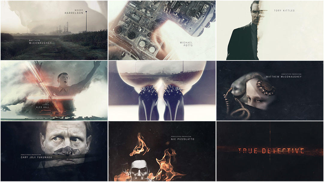
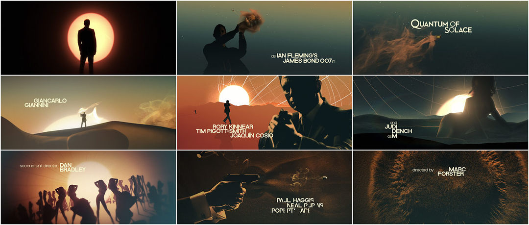
Although sub-par, the below shows how we have utilised colour and a mixture of photoshop and drawing to create the images for our story board. Through the use of colour we are not only able to differentiate between our characters but also show the tone the film will take, with the prominent light and dark blue lighting being something we have wished to emulate since the start of our project, taken from such aforementioned films as Welcome to The Punch and The Dark Knight Rises. As well as using technology to colour we have also utilised google images in order to provide us with sections to our images, such as the world map in the centre-right shot and the face which the photo frames in the bottom right hand shot. By doing this we are better able to visualise the look of our trailer, meaning that when it comes to the day of filming we are better prepared to find the exact correct lighting and locations.


MT  
JL

Friday 28 November 2014

Secondary Antagonist Actor

We have cast Joe Rose as our initial antagonist. Although central to the plot, this character has minimal screen time, but will be required to do a few different shots. We feel Joe has the right look for this role, who, despite being a younger criminal, is very intimidating and high up in the world of crime. This will give him a certain arrogance and swagger that need to come across on screen in a short space of time, and we believe that Joe should be able to pull this off. As we are relying on him for filming dates, it is also useful to us that Joe is free during the holiday period in which we wish to do our filming.


The above photos show that Joe can inhabit a casual or formal look and not appear uncomfortable or out of place. This is useful for a character whom we have yet to pin down a costume for, and could in fact be in either sort of clothing.

CM

Friend Actor

The character to play the role of the friend is going to be Max Twyman, one of my partners in
 the production of the film. Due to the limited time scale and the size of the part we thought
 that by having an already established actor playing the role of the friend we could kill two birds
 with one stone, having someone who is readily available and devoted to the production of the
 film and good at acting, emphasising the friendship side of the relationship as well as the
 aesthetic side. Seeing as he doesn't have a job within the police office he doesn't have to
 wear uniform and as such we can dress him in clothes which emphasise his age and looks.


The above photo shows his role in the most recent school play, Anything Goes. 


Taking centre stage in the photo, wearing the blue jeans and black shirt, this will be very 
similar to what he will be wearing within our film, due to the scene in act 2 being set within 
his own house. 


This is the most recent photo of max to show how his features can have him looking older
 than his age suggests, the costume which is planned is shown below. 


JL

Aaron Mays - Protagonist Actor

Due to the limited amount of people available for our film, even though we are considered to be the next big thing coming out of London, we have had to choose an older looking fellow student of ours instead of a more adult actor to play the protagonist of a policeman. The reason for this is because due to the narrative, a tale of revenge from some years ago, the actor needs to look like he has had enough experience at the job to have a position in the force such as this as well as being taken seriously. Strange as it sounds, the criteria we were mainly looking at were build and whether a beard was possible, which for our final choice, it was. Below are two images, both from before 6 months ago, showing how even then he would have been a relatively safe choice for the part.


Gabriel (Pictured above) was the easiest and most practical choice for the part, especially considering he is not going away during the Christmas holidays when we wish to get the majority of our filming done. He is also considered good looking, so the implied relationship with the girl which is first established in act two is also not so farfetched/has some tangibility. With quite a muscular build and a decent height he does not look too scrawny or short to play the part, and would gain support from our piers for the play due to being well known throughout other schools. A sort of South East London Ryan Reynolds. More posts are to come showing him in costume, with any props needed. 

JL

Actors

We have here come up with some options for the actors of the various characters in our trailer:

Aaron Mays - Gabriel Zedda-James

Main Antagonist - Danny Levart, Steve Twyman, Michael Hajiantonis

Damien Rowe - Alfie Mann, Michael Hajiantonis

Female Character - Lizzie Grice, Naomi Adeboye

Friend - Max Twyman

Extras - Georgie Ward, Joe Levart, Antonia Legg, Thomas Payne

MT
CM
JL

Character Names

In the process of casting for our film, we came to the realisation that we do not have any names for our characters. The only two named in the film are the protagonist and the first bad guy, so these are the only names we need. I came up with a list of potential names and the group discussed these, finally coming to the consensus of the name Aaron Mays for the protagonist and the name Damien Rowe for the first bad guy. The protagonists name depicts him as an everyman, but a good guy, whilst the name Damien Rowe is vaguely evocative of the sinister nature of the Damien character in The Omen, as well as being a good name for Mays to say in the opening scene.

CM

Tuesday 25 November 2014

Narrative Graphics Influences

Welcome to The Punch - The narrative graphics used within Welcome to The Punch were a major influence of
ours, as was the film itself. The blue on black which is shown so much within the trailer is reflected within the narrative graphics, showing phrases which enhance the narrative along with the colours used, bearing connotations of big city life and mainstream films. The graphics use a blacked out png file with transparent text in the middle which is then placed in to a video editing software, overlaying the png on top of a moving/animated still of a city which has effects added to it. There are then multiple light and smoke layers placed on top of the black screen, which connote mystery and add to the aesthetic effect of the graphics. There is a slight reflection of the text in certain areas of the blacked out background which shadow the moving image which animates the graphics, and the words get closer to the foreground of the screen as they go on. This highlights their importance as well as emphasising the technical skill needed to make it, bring the audience closer to the animated background and smoke overlays.

Only God Forgives - These narrative graphics are similar to Welcome to The Punch in their use of colour to bear connotations of the film, as well as their use to enhance the storyline. Apart from this, however, there is not much similarity at all. The use of dark red/neon colours throughout the film is reflected within these narrative graphics, connoting danger, lust, death and love. These are shown within the shots in the film, however the Oriental feel really comes out within the first two narrative graphics especially, showing these neon style text segments overlaying a traditional Samurai pattern on a paper wall. The final narrative graphics, which introduce the actors, don't replicate this use of traditional oriental design in the background and as such suggest something concerning the film, a sort of out of place-ness. The director is also introduced within the graphics, labelling himself as "Visionary"and referencing previous films he has done, of which Drive is his most famous. The fell of the graphics are very similar to the tone of drive, which can be seen later in the post, and as such builds up a fan base of stylised high budget crime thrillers. As previously, the text and background image come towards the audience, bringing them in to the film and increasing appreciation of the style of the film.

Hummingbird - The graphics within Hummingbird are very different to the previous two examples/influence. They prefer a clean and easily readable style which again connote things which are going to happen but are done much more plainly, perhaps referencing the lower class/dangerous background in comparison to the previous two examples. The text is a sans-serif font with an outer glow and written entirely in capitols on a black background, again utilising smoke and light overlays to stop the graphic looking completely plain. The fragmentation of the words, as can be seen in the first example, bears reference to the main characters past and in hindsight is a quirky and interesting touch on behalf of the director, which only the active audience members ail pick out. This is reflected within the fact that the text is not centred on the screen and enforced through the shots shown prior to and post-graphic, leading the audience to experience a complete feel for the film as something more than just a mindless Jason Statham action movie. As the pace of the film picks up, the overlays on the background become more and more vivid and the text becomes bolder and with a greater glow radius, showing how what is says is becoming more and more important.

Drive - These graphics are the most different from the previous three examples. Instead of being overlaid on top of a black background which has some form of effect on it they are overlaid on a panning ariel shot of the city. This would imply, along with the simplistic font and slight effects on the text, that what they are saying is more important than the connotations of knowledge of the city and sense of direction which come through. The reference to the actors Ryan Gosling and Carey Mulligan are therefore implied to be the films best selling points, along with the strong narrative which is established and the stylised and slightly Only God Forgives-esque neon/city feel. Because of this simplicity there is less to talk about due to the majority of the narrative telling being done within actual shots, and as such are not so much influences, but an option which we may be able to consider. We will probably not use this design however, as due to our lesser film making abilities, require the narrative graphics in order to enhance the narrative to a similar extent than our shots do.

Sunday 23 November 2014

Narrative Graphics

Narrative graphics are the black screen's usually accompanied by text which are shown throughout a trailer in order to enhance the storyline and allow the narrative to become clearer. Such examples of this come from Redemption, previously named Hummingbird, stating "Time to heal" and "A second chance" on two separate occasions. In conjunction with the shots shown, this tells us where the narrative is going and the tone of the film. By using relatively passive narrative graphics, instead of something along the lines of "Know your enemy" from Welcome to the Punch, one can infer that the tone will take a more emotionally based setting and there will be a lot more focus on the character and his relationships. Some examples of possible narrative graphics are shown below, which were made in one double period by yours truly.


The use of smoke in both narrative graphics board was inspired, once again, by Welcome to The Punch. The white and grey blocks in the background show that the middle is transparent, leaving us to find a moving motion picture or video, either shot by us or taken from a  non copyright website. The different colours, red and light blue, are the most prominent colours in our film and bear connotations of danger, desire and high budget films. Although not finalised, the textual content of the graphics comes from the idea of both the police and the underground gangs chasing our main character.


We found that the idea of having passive, still smoke on the narrative graphics looked too amateur however and as such changed it to show more technical ability. Using Motion, we created overlays, one of which utilised the using the effects "Embryo" with other effects such as blurs, and then animated to have it moving across the screen. Incidentally this overlay was also used in our ident due to how well it turned out. An example with the overlay on a black background can be shown below, as well as the motion settings which were used.


The Example:


The two above narrative graphics are shown below without added effects from motion and how they were composed using Sony Vegas 12. This was done through using the effects Motion Blur, Wave and Colour Correction underneath a black rectangle with the text cut out which was done in Photoshop (The second graphic down comes first)


Our final narrative graphic comes from inspiration found in Hummingbird. Although not exactly a narrative graphic as it does not extent the story, as such, introducing previous films which the directors have made is an essential part in raising awareness of the trailer. Because of this we created a background on Photoshop, made up of various layers of non-copyrighted images and including a picture of a sunset I took while in Greece. This was then overlayed with "From the Director's of" and either "Existence" or "The Shadow Man" depending on which shot it was going to be for. These were then assembled on Sony Vegas, again utilizing the Wave and Glow Video Effects to produce this graphic.


JL

Saturday 22 November 2014

Credit Plans


This initial design for the acting credits of the film is essentially a more stripped-back version of the title graphic that I have designed in Motion. It ought to be slower when input into the final trailer, and could perhaps be a little tidier, but I feel that it is a good basis and plan for the credits, which should be very strong given their prominence and positioning within the trailer. I will make the alterations required once we are in the editing stage, as I will then get a better feel for what the trailer needs to look like overall.

CM

Friday 21 November 2014

Credits Influences and Research

Zodiac:


Order of credits as they appear on screen and why:
  • 0.15secs - 'Paramount Pictures' appears on the screen - production and distribution company/s appears first before anything else and this is usually the case for all crime/thriller trailers. 
  • 0.30secs - 'From the Director of se7en and panic room' - promoting the director of the film and his previous work opens up a wider audience due to the fact that people who enjoyed the films mentioned are likely to go and see this one. This is more of a choice, often depends on the popularity/fame of the director. 
  • 1.43secs - 'Based on real events' - again attracts a wider audience and creates tension, which is the overall aim of the trailer.
  • 2.10secs - the three main actors are now revealed to again attract a certain audience and inform people watching who they are going to see. This is clear from the trailer itself but it is a necessity to show the actors names and often the bigger stars will have their names revealed before the other members of the cast.
  • credits appear at the end of the trailer (2.25secs) as they are stating who has been involved in the film/trailer we have just seen.
  • Simple white font (something easily found on either word/final cut and/or motion) on a plain black background. 
  • order of final credits is similar to the order previously mentioned.   
Departed:


  • 0.18secs - Production/Distribution company/s introduced again (usually most famous and most involved) - follows a similar pattern to Zodiac trailer. 
  • 0.34secs - 'A Martin Scorsese Picture' - similar pattern with director but this time they have chosen to reveal the directors name. 
  • 1.07secs - 'Loyalty is a lie' - the main tagline of the film is introduced, which gives the audience an idea about the major theme of the film, which in this case is 'trust'. I particularly like the way they have used two different colours (blue & white) in the graphics to again further support this tagline, that everyone in the film is 'two-faced' and the truth is not being told. This links into our film and the major theme of 'Two-Evils'. 
  • 1.16secs - 'Sacrifice is a test' - another tagline - creates excitement and again reveals the major themes of the film. 
  • 1.32secs - 'How far can you take it?' - third tagline.
  • 2.07secs - all the most famous actors in the film are introduced similar to that in Zodiac. 
  • 2.18secs - title of the film is introduced - good use of connotation with the title appearing in the shape of a gun as it not only suggests the genre of the film but leaves a lasting image in the audiences head, which will then carry into the film itself. 
  • 2.22,23,24secs - end credits introduced (same as in Zodiac).   
'Welcome To The Punch':


  • 0.19secs - production/distribution company again introduced first (momentum pictures)
  • 0.37secs - 'In 2013' - the graphics in this trailer are undoubtedly our major influence with the city landscapes appearing behind the the words themselves. This phrase also creates excitement amongst the audience watching as it adds a sense of pace to the action in this trailer. 
  • 0.41secs - 'Know' - same effect as previously mentioned. 
  • 0.45secs - 'Your' - interesting use of graphics that wasn't used on the two trailers prior to this one. Keeps you guessing as to what phrase will appear next.
  • 0.51secs - 'Enemy' - similar to departed these tag-lines/phrases set up the theme's of the movie as well as create excitement amongst the viewers. 
  • 1.08secs - executive producer/director introduced much later than usual. 
  • 1.42secs - 'Welcome' - clear that the title is going to be introduced in the same style as the taglines previously. 
  • 1.43secs - 'To' - "
  • 1.44secs - 'Punch - "
  • 1.45secs - whole title introduced - different to previous trailers as their is a short moment of action after the title is revealed and before the end credits are introduced at 1.48secs. 

MT

Thursday 20 November 2014

Motion Title Designs

Following my attempts at still designs for the title card on Photoshop, I moved to Motion to see if I could use my ideas from influences, planning, and previous attempts, to create a moving title card that would look more effective following a sound boom and dramatic montage. I came up with three designs here, and I will ask the group which they think is the most effective.


This first design is monochrome, which I do not think plays into our genre or tone. The smoke effect of white on black does have a certain boldness but I personally would not choose this design as the final title card.


This design is coloured, and fits better with the colours and tone we intend our trailer to have, but I don't think the smoke effect is as effective as the first design, potentially due to the white text on the brightly coloured backdrop.


I believe that this third design is my strongest. It takes the best points from the still Photoshop design and adapts them to a moving Motion image. The colouring is bold and the smoke effect gives the feel I think I have been meaning to achieve throughout the design process.

CM

Tuesday 18 November 2014

Initial Title Graphics Designs

As part of my research into titles and title graphics, I decided to come up with a design in order to ascertain the difficulty involved in different aspects of design, and to get a better feel for the look of our trailer. The title used is only a working title, as 'Two Evils' gives the title a slightly more horror-style feel, which is not something we are looking for.


This first attempt I think can be said to be one of varying success, but it may well influence our final design.

There was another attempt before this, however this was attempted using Illustrator rather that Photoshop, and using the Rockwell Extra Bold font suggested by Joe in his graphics research. My knowledge of Illustrator is limited, and I was attempting to get some sort of smoke or cracking effect on the backdrop. The colour scheme is along the correct lines but other than this, very few aspects of this titlecard are successful. This altogether less successful initial design can be seen here, in the wrong aspect ratio, in the name of showing the full process of my designing endeavours.


CM

Monday 17 November 2014

Art of the Title

The artofthetitle.com website takes the credit and title sequences of movies and distills them into a wall of stills. Although we are making a trailer rather than a film opening like we did last year, this site will still be invaluable in terms of aesthetics, fonts, colouring, and style for our trailer.


I love the aesthetic of these first two sets of titles, although how applicable they are to our project is limited. The use of visual metaphor and bold imagery gives both sequences impact and memorability. The title card for Quantum of Solace is particularly bold, and I would like to create something with a similar use of light font on green/blue backdrop, as well as playing around with similar sand/smoke aesthetics. The vibrancy is perhaps not strong enough for the tone of colour we hope to adopt, but something with a brighter blue or stronger green could work. As for True Detective, the use of iconography is powerful, and certainly something for us to consider in composing our shots and where the credits are placed.


In terms of colouring, and potentially font, the Fight Club opening credits are a great influence. The biological iconography is unrelated to our trailer, although the nervous system images are an interesting image for a production or distribution ident (similar to Paranoiac Productions last year). The bright blues and whites on the darker blue background images suit our central London settings and the colour tone we are intending to set in our trailer, as well as being bold and eye-catching and thus usable in a similar form in our posters or magazines. A similar, but in my opinion less effective, design can be seen in the opening to Moon, which loses some of the impact of Fight Club due to its inconsistency and weaker font.

The site has provided me with a range of different ideas and influences about what works and doesn't. For our trailer, bearing in mind genre, tone, and our planned colour schemes and imagery, there are certain aspects we can draw from the examples given here, especially in terms of font and backdrop colouring and juxtaposition.

CM

Title Fonts


There are a number of different styles we can go with in terms of a font for our title, the first of which being a more horror-style font. A selection of these can be seen here, using the working title 'Two Evils' (which will likely be changed). Although evidently designed for horror films, these fonts are very bold and impactful which would be good for our trailer. With the right colour scheme and some subtle editing on Photoshop, some of these fonts could be made to conform to our genre quite well.


There are also default fonts on Word, some of which might be appropriate for our title. Rockwell Extra Bold, the first of these shown here, is the suggested font for graphics by Joe, which is why I have included it. The three others are more in line with the 'Hummingbird' influence, and there are options of both serif and sans serif fonts (although I personally think that sans would fit our genre and influences better).

CM

Specific Influence: Hummingbird


My biggest influence in the way our titles ought to look is 'Hummingbird'. Our intent with the trailer is to contrast an intense montage with a slower paced shot of London, followed by the title and preceded by a sound boom. This requires an impactful but not entirely dynamic title. The 'Hummingbird' title uses a simple, sans serif typeface in a slightly yellower shade of white, with wide letter spacing giving the otherwise tame sounding title a sort of ominous gravitas. It appears on a green/blue darker background that is evocative of smoke or space. This is a highly effective use of a title card, with minimal animation but strong graphical design, making something of it's kin a viable option for us to use and design in our trailer.

CM

Sunday 16 November 2014

Title Idea

We have been for a while stuck in terms of an actual name for our film. My suggestion has been 'Two Evils'. This title fits with our narrative as the protagonist must  choose the lesser of two evils (the evils being the main bad guy and the police chief, both of whom want to kill or arrest him). It is also reminiscent of films similar to ours with titles appropriate to the plot whilst being outwardly fairly vague, such as 'Eastern Promises' and 'Welcome To The Punch'.

One of the downsides to this title may be its vagueness, although I feel this may conform to the genre and not really be an issue. However another issue may be that 'Two Evils' is reminiscent of a different genre - namely Horror. Films like 'Drag Me To Hell' and 'Deliver Us From Evil' are solidly within the boundaries of the Horror genre, but similarly to 'Two Evils', use expressions or quotes in their titles, as well as terminology that suggests the demonic, satanic side of the Horror genre.

In any case, Two Evils' is my proposal for our film title, despite its possible Horror connotations. I remain open to any other suggestions from the group, as I do acknowledge the title is not perfect.

CM

Title Influences

The title card of our film will be an important way to signify genre and tone, and can be used as a way to catch the eye of the trailer-watching audience.


I posted earlier in the year about intertitles.tumblr.com, a blog which routinely posts a selection of title cards across a range of genres. This will be useful to us for deciding the sort of aesthetics we like, as will artofthetitle.com, a similar website that posts selected screenshots from the openings of films, including their title cards. In the post about Intitles I included a collage of titles I particularly liked, and this can be seen above.

Titles that are of a similar style or genre to ours that are shown on Art of the Title include Fight Club, True Detective, and Casino Royale. These three title cards are punchy and relatively simple whislt still being relevant to the film and reflecting its style, which really ought to be a key point of an effective title.

Our specific influences also can provide inspiration and influence us in our design, especially pink and blue colour schemed films like Only God Forgives, Hummingbird, and Welcome To The Punch. Although Only God Forgives is slightly further from what we would like to pursue than the other two, its colours and boldness can be learned from as an example. The Hummingbird and Welcome To The Punch titles are similar both to each other, and to what we would like to achieve. Both are bold, would serve us well in our dramatic title reveal, complete with sound boom, and have colours and fonts reflecting accurately the tone of the films they belong to.


CM

Friday 14 November 2014

Taglines

The slogans that we are using in our trailer came from my shot list proposal, into which I had inserted two shots of tagline amongst the montage, as is the convention of the genre. The sentence is broken into two sections; 'When you're caught between two worlds...' and '...which way do you turn?'. In between these are shots of the two conflicting forces that converge upon our protagonist in the trailer - the criminal boss and the police chief boss - which I think is a nice way to demonstrate in a more visual manner the dire situation of our protagonist in being caught between these two worlds.

CM

Thursday 13 November 2014

Shot List

On formulating our shot list, we all brought our own versions and ideas to the table, and what I took were these ideas for each act. As a group we agreed on a very similar final shot list to the one I put forward, with some changes in the first act and the opening to the second act.

CM

Shot number
Shot
Dialogue/Sound
Time
1
Interior of car at night – protagonist driving
2
Conference room, protagonist talking to his ‘team’
P: We’ve been after (bad guy) for a long time, and now maybe we have a shot
3
Fade in and out of bad guy looking scary
4
Pan up on building/hotel/house at night
P: The tip off says he’s gonna be in (location) by 2300 hours tonight
5
Conference room again
P: This case has personal significance to me, (bad guy) is the bastard who killed my partner in ‘09
6
Shot of crime scene pictures on wall or table
7
Conference room again
P: So no matter what happens tonight, I’m first on the scene right…
8~
RAID SEQUENCE SHOTS
P:… I get to him first
9
P leaning beside door ready to burst in, hits door and runs in
10
POV shot finds dead bad guy
11
Fade to black
BOOM
12
Studio
News: One of London’s Most Wanted was found dead today in (location), police are treating the death as suspicious, potentially at the hands of one of their own officers
1
P being lead out of the location – not arrested but with an ‘escort’ who are keeping an eye on him
3
Boss:  This looks bad (protagonist), I knew how badly you wanted to take this guy down…
Interrogation type scene, boss circling P
2
13 ACT 2
Fade to black
Boss: …but you’ve gone too far…
1
14
Back to interrogation (moving?)
1
15
Close up on boss
Boss: …We are gonna have to keep you here (protagonist), at least until they decide what to do with you
2
16
Protagonist escapes
Fade out
Muffled sound and booms
1
Protagonist running
Fade out
1
More running
Fade out
1
Fade up P at bar
1
Shot along the bar, girl approaches P
Girl: Rough day?
1
Close up on P
P: you wouldn’t believe…
1
Fade to black – Winner of the *** award
2
Mid shot of girl and P
Girl: you know you’re innocent (protagonist), you just have to convince them
2
Fade up of a house, P (and girl maybe?)walking up to door
Knock on door
1
Close up on door, opens and sidekick bloke comes out
Sidekick bloke: What are you doing here man? Half the Met’s out looking for you!
2
Reverse shot of P at door
P: I need your help mate, it wasn’t me
1
In the friend’s living room or kitchen now
Friendly sidekick man: You knew this case better than anyone (protagonist), who could’ve killed him?
2
Low angle on P
P: whoever it was, I wouldn’t want to meet him…
1
Shot of main bad guy (maybe hand or from back?)
P: … (bad guy) was powerful, influential even. This must’ve been a vicious coup…
2
Back to scared looking P
P:…we are dealing with someone bigger and badder than (bad guy) ever was
2
Shot of bad guy in plain view
1
?
Fade to black – Girl actor
1
Girl running
1
Girl stops and hides behind wall/pillar/door – main bad guy approaches slowly, looking for her
Heavy breathing
2
Fade to black  - main bad guy actor
1
Main bad guy laughing evilly
›:D
1
Fade to black – protagonist actor
1
P running along Southbank (maybe a few different shots)
1-3
Fade to black – When you’re caught between two worlds…
1
Close up of main bad guy
MBG: You find him and you kill him, tonight, or we’re all screwed!!
2
Close up of angry boss
Boss: I want (protagonist) in my questioning room by tomorrow morning! Find him god damn it!!
2
Fade to black - …which way do you turn
1
Shot of P holding gun out one way…
1
…And the other way
1
Cut to black
Gunshot
1
Running girl
1
Running P
1
MBG throws glass
1
P holding up gun shaking
1
Fade to black – a GameChanger production
1
Sidekick’s door shoved down
1
Sidekick reaction face
1
Corridor, P walks in, sees Boss, runs
Boss: (protagonist)!!
1
Girl, scared, next to wall with mbg close
1
Shot of london
2
Film Name
3