In what
ways does your media product use, develop, or challenge forms and conventions
of real media products?
In terms of general setting, London was the obvious choice due to our proximity to the city centre and its recognition around the world, especially following recent world blockbuster films such as ‘Skyfall’ and ‘Sherlock Homes: A Game of Shadows’. Thriller films have a long history of utilising London as a setting, with Hitchcock films such as ‘The 39 Steps’, and ‘Frenzy’, leading onto classic spy films including ‘The IPCRESS File’ and ‘The Deadly Affair’, which in turn ushered in the numerous Bond films that feature London, and countless gritty crime films, such as ‘Easter Promises’ and two thirds of Mike Leigh’s filmography.
The use of an urban setting conforms absolutely to the crime thriller genre in which we have worked, with films like ‘Zodiac’ and ‘Leon’ utilising recognisable cities in both the construction of the film and its marketing. ‘Se7en’ and ‘Only God Forgives’ both adapt this for effect, with the former contrasting the urban feel of most of the film, to the rural in the final scene, and the latter utilising Bangkok to provide a simultaneously urban and alien environment, which alters the dynamic of the film. We wanted to achieve a similar effect, and thus chose to use both the dark alleyways and flashy neon of ‘Hummingbird’, in conjunction with the higher class glossy-feeling city locations featured in ‘Welcome to the Punch’, thus creating a dichotomy of tone that engages the audience, and utilises the conventions of the genre to our benefit.
Graphics
In terms of both narrative and title graphics, we took ideas that complied with the darker forms of crime thriller trailers, and even some horror trailers. The trailer for ‘Hummingbird’ utilises a similar colour scheme and tone to our trailer, although we have selected a bolder type than it does, something more in the ‘Eastern Promises’ vein. The slow zoom and spark effects are reminiscent of some horror and action movies, which does not necessarily conform to our genre, but might be effective in marketing to a wider audience, and thus conforms to the advertising function of the trailer form.

For our ident, we created a look that went well with our trailer as a whole, maintaining the necessary pace and drama of the thriller trailer, but also could be for a production company that produces other genres of film. This required a fairly nondescript colour scheme (hence the monochrome used) paired with a bold image and name, which I feel ‘Gamechanger Productions’ achieves.
Narrative
Aesthetics
The aesthetics of London were particularly important to us, hence our use of Chinatown and the Southbank to utilise the lighting therein. The vibrancy of locations such as these have been used in many similar films to ours, as cited above in the Location analysis.


Conclusion
The trailer form and crime thriller genre of our production have given us a fairly particular framework for its formulation and construction. We have utilised the conventions of our form and genre in such a way as to connote the nature of the film and appeal to its standing audience, but have employed our own creativity and originality in relevant areas, in order to provide our film with personality and a USP.
We try to differentiate our film from others of the genre through colour and tone, though in all fairness this is a convention in itself, especially on the part of particular directors and their aesthetic styles. Aspects such as music, editing, and narrative are however, far more typical of the genre, and thus are not any USP (though they are, of course, very important to the success of the trailer as a whole). The key was for us to strike a balance between keeping enough features and conventions to make the genre clear, and producing something that we could be individually proud of as an original and different piece of media, and I feel that we have achieved this balance well.
Some of the key influences: |
| Images from our key influences, presented in the style of artofthetitle.com |
 |
| Images taken from our trailer |
Location
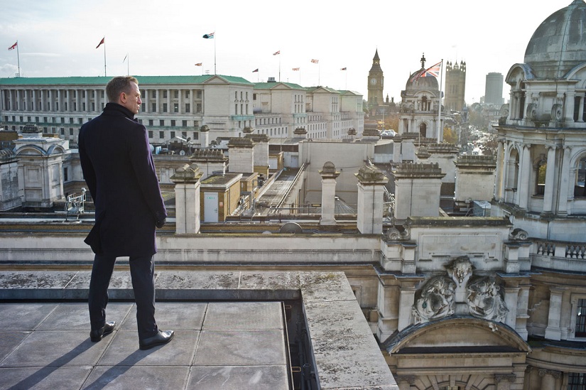 |
| 'Skyfall' utilised London as a location throughout, and represents a larger trend of using the city in all sorts of genres |
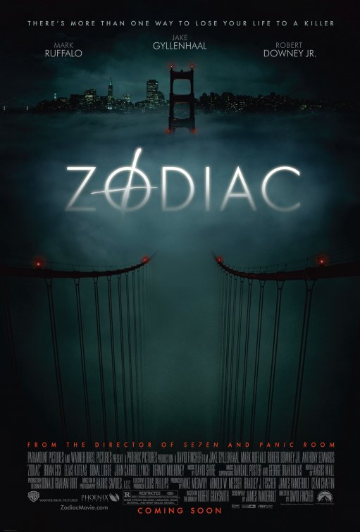 |
| 'Zodiac' uses its San Francisco location as a key selling point. |
In terms of interior locations, we were fortunate to gain access to very apt spaces for scenes such as the boardroom and the interrogation room. We based the appearance of these ‘police department’ locations on those featured in TV crime dramas and thrillers such as ‘How to Get Away with Murder’, ‘New Tricks’, and ‘Life on Mars’, as well as our key influence in terms of the police side of the narrative – ‘Welcome to the Punch’. The use of these locations certainly conforms to the crime aspect of our genre, and helps the narrative of the trailer in addition, as we move from the brightly lit boardroom, where Aaron is in control, to the dark and sinister interrogation as his own institution turns against him. This is a stylistic feature inspired by the work of directors such as Nicolas Winding Refn, and one that is similarly used in teaser and trailers of the thriller genre, such as for ‘Drive’ and ‘V For Vendetta’.
 |
| The scenes in the briefing room represented a conscious effort to ensure the audience knew Aaron's profession, and took inspiration from many police station sets in real media products. |
In terms of both narrative and title graphics, we took ideas that complied with the darker forms of crime thriller trailers, and even some horror trailers. The trailer for ‘Hummingbird’ utilises a similar colour scheme and tone to our trailer, although we have selected a bolder type than it does, something more in the ‘Eastern Promises’ vein. The slow zoom and spark effects are reminiscent of some horror and action movies, which does not necessarily conform to our genre, but might be effective in marketing to a wider audience, and thus conforms to the advertising function of the trailer form.
 |
| The graphics for our title and slogan tie together our genre and our USP of colour and tone. |
 |
| Our studio ident was simple but bold, able to make an impression without detracting from or disrupting the overall feel of the trailer. |
Our narrative follows both the conventions of Todorov’s narrative theory, and that of the crime thriller genre. We use a classic ‘Redemption’ storyline, as our police officer protagonist is falsely accused of a murder and must prove his innocence by finding the real killer. The narrative of the film is not the USP, as it could never be accused of non-conformity or being ground-breaking. The story bears strong resemblances to that of ‘Welcome to the Punch’, and many other crime thriller films, and the trailers for these films tend to include one or two fairly major plot points or twists, whilst balancing narrative vagueness and clarity – creating a concise and enigmatic depiction of the film’s storyline. We tried to emulate this in our trailer, and the narrative that we presented, and as such we reveal the initial plot twist at the end of Act 1, as part of the films premise. This is followed by the elaboration and continuation of the plot in Act 2, and the montage in Act 3, both of which hint at the nature of the criminal enemy, and depict scenes of unforeseen conflict. In this way, I would suggest that our narrative, and its presentation in the trailer, conform to the conventions of our genre and form, utilising classic story types, adapting them, and depicting them in the appropriate manner.
Characters and actors
Our protagonist, Detective Aaron Mays, is very much the archetypal crime thriller protagonist; embodying the anti-institution, justice driven, good looking, flawed, European, masculine figure that is well known to cinema and television audiences. He was dutifully portrayed by Gabriel Zedda-James, who we felt had the right look for the character, which we had based initially on leading men such as James McCavoy, Ryan Gosling, and Jake Gyllenhaal. We got the initial idea for our female character from ‘Hummingbird’, and the caring ‘voice of reason’ figure played by Agata Buzek. This is a character that regularly appears in male-led mainstream cinema, and it is safe to assume that a continuation of the narrative would see a romantic involvement between our female character and Aaron. In the development process of our narrative, we took the decision that for the purposes of representation, conformity to the genre, and fleshing out of the narrative, this female character was required to be featured in the trailer. A similar process took place with the inclusion of the friend character, as we needed someone for Aaron to go to that he could trust, facilitating some narrative exposition on the subject of the major villain. Thus our characters tend to perform a narrative function, which is appropriate for a trailer, seeing as there is a necessarily minimal level of character development in such a short production, especially one that intends to introduce the audience to the film’s premise and characters
 |
| Gabriel Zedda-James as Aaron Mays, as he appears on our chosen poster. |
Our initial antagonist, Damien Rowe, has more screen time dead than alive, due to slight changes to our shot list and our use of an overlaid image of the character rather than a separate close up, and as such, the actor was not required to perform in a huge capacity. This meant that his characterisation as a murderous, high profile criminal needed to rely on costuming and casting. The dressing of dangerous criminals in suits features in films from ‘American Psycho’ and ‘Scarface’ to ‘Die Hard’ and the ‘X-Men’ series, and as such this was the obvious choice for both of our antagonists, with the more mysterious, more malevolent, second antagonist donning a long, dark coat. This is also a conventional costuming decision for an ‘arch-villain’ character, with examples both outside the crime thriller genre (Crowley in ‘Supernatural’ or Bane in ‘The Dark Knight Rises’) and within (John Rooney in ‘Road to Perdition’ or Hannibal Lecter in the ‘Hannibal’ TV series). The casting of this character required an older figure in order that the character might carry some gravitas and be believable as the sort of villain we wanted – someone in the Ben Kingsley, Anthony Hopkins, John Hurt, vein of intimidating older men.
 |
| Mads Mikkelsen dons the longcoat on TV as the eponymous Hannibal. This is one example of the use of the long coat in costuming deadly villains. |
One of our key aims in our trailer, from concept to construction, has been to create something visually strong. The intent was to utilise lighting, editing, and location in order to form a vibrant and eye-catching piece of marketing. In many senses, the colour and tone of the trailer has been our USP, something that we drew from key influencing trailers such as ‘Welcome to the Punch’, ‘Only God Forgives’, ‘Hummingbird’, and ‘Drive’ – all of which use neon or fluorescent lighting in order to create a powerful visual that differentiates them from greyer trailers and films such as ‘Gone Girl’, ‘Inception’, or ‘The Bourne Ultimatum’. Since making this decision, it has become more evident that this is not a feature of just crime thriller films, but many 2014/15 mainstream releases, such as ‘Birdman’, ‘The Guest’, ‘Guardians of the Galaxy’, and ‘Inherent Vice’. This places our trailer at the cutting edge of mainstream cinema in terms of colouring and style, whilst remaining accessible through its broad narrative appeal and genre.
 |
| The work of Nicolas Winding Refn and similarly styled pieces has influenced us greatly. Throughout the process we have considered colouring and style to be of paramount importance |
 |
| 'Inherent Vice' is just one example of the numerous recent films that have used neon imagery as a major selling point. |
 |
| This shot from outside London Aquarium is an example of our utilization of the aesthetics and colours of London. It also demonstrates part of our endeavour to include well composed shots, in line with our cinematographical aims |
Cinematography has also been a key focus of ours throughout the construction, doing our utmost to ensure a well framed and powerful shot. We attempted to use symmetry in some shots, though this may have not come across in the final cut, and used camera angles and movement to try and create the slick and professional looking imagery that the modern audience has come to expect from any half-decent trailer. The use of striking cinematography has long been a marketing device and an effective filmmaking tool, practically the hallmark of directors and producers like Wes Anderson (‘Moonrise Kingdom’, ‘The Grand Budapest Hotel’) and Bryan Fuller (‘Pushing Daisies’, ‘Hannibal’). In terms of our specific genre, ‘Welcome to the Punch’ employs symmetry and a wide range of shots, though remains less stylised than the aforementioned directors’ works, as does our trailer.
 |
| This shot, taken from Wes Anderson's 'The Grand Budapest Hotel', is an example of the sort of strong, sometimes symmetrical cinematography that we strived for in our filming. |
Iconography
 |
| 'Sin City' is a great example of iconography in the crime thriller genre, due to its comic book, over-exaggerated style. |
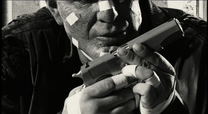
In terms of iconography, crime thriller is one of the more relevant genres (second perhaps only to Film Noir, westerns, fantasy, and sci-fi), due to its relative niche-ness in terms of narrative possibilities. As such, we had a few key images to include in our trailer that helped us to connote genre. The most obvious example of this is the gun, which makes an appearance in many scenes of the trailer, as it does in countless action and crime based thrillers. The more differentiating iconography that designates our film as a police oriented one comes in scenes such as the boardroom, where the mindmap/moodboard/planning board is a feature of police offices and meeting rooms in films, TV, and of course, reality, that is well known and clearly depicts the characters we are watching as detectives. The boss’ costume is also an example of iconography, serving more to connote character than genre, as he is dressed in the recognisable 1980s YUPPIE style that has come to be associated with undesirable figures such as Patrick Bateman (Christian Bale) in ‘American Psycho’, and Jordan Belfort (Leonardo di Caprio) in ‘The Wolf of Wall St’.
 |
| Patrick Bateman in 'American Psycho', exemplifying the sort of costuming that we wanted to put our malevolent boss figure in. |
Editing
Our editing was designed to create the fast paced and dramatic tone that is a key feature of the genre and form of thriller trailers. We organised the music and cuts in conjunction, creating a rhythm that runs through the entire trailer. This allows us to employ a range of transitions – quick cuts, cross fades, et cetera – that keep the trailer engaging and at the correct pace. This means of creating a sense pace comes specifically from ‘Welcome To The Punch’, but on further research is a distinct feature of the more high-key crime thriller (as opposed to the somewhat more sedate ‘Zodiac’ and ‘Se7en’).
 |
| Visually similar shots were colour matched in Final Cut, in order to give us the colouring consistency that we aspired to. |
Our editing process also gave us the opportunity to apply our Aesthetic vision to certain shots, mostly by using the Final Cut Pro ‘colour match’ function. In this way we were able to keep the colours vibrant but consistent, as in the trailers for ‘Only God Forgives’ and 'Welcome To The Punch'.
 |
| 'Welcome To The Punch', a key visual influence, uses many shots that are similar in colouring, in order to give the film a unique and distinctive look and feel, something that we absolutely wished to emulate. |
Music
The music featured in our trailer was provided by an outside source, but tailored to our trailer and thus its genre. In conjunction with Editing, the pace, and thus overall effectiveness of the trailer as whole, comes largely from the music. A feature of many recent trailers, specifically in the horror and psychological thriller genres, but also more generally (for instance in the trailer for ‘Avengers: Age of Ultron’, and the teaser for video game 'Just Cause 3'), has been to contrapuntally slow down and fade out at the end of the trailer, something that we have emulated with our piano-based ending. This leaves the atmosphere of the trailer lingering in the air following its close - a very effective technique for making the audience remember the trailer.
 |
| The trailer for the upcoming 'Avengers: Age of Ultron' uses a cover of 'No Strings On Me' (a poignant choice for a film about a servile AI turned murderous robot) which, in the last seconds of trailer fades to a chilling finish. https://www.youtube.com/watch?v=I1968HY4DKc
|
 |
| The trailer for 'Just Cause 3' uses a contrapuntally calm cover of The Prodigy's 'Firestarter',which has a similar effect to the above, and our trailer. https://www.youtube.com/watch?v=dFmBmRmHHeE&safe=active |
Aside from this, our music, in terms of genre, could have gone either of two ways in order to conform to our trailer’s genre – orchestral and epic, or electric and intense. We chose the latter, and the result is a more intense and equally dramatic trailer, and in this our music matches our choices for vibrancy of colour and imagery.
Conclusion
We try to differentiate our film from others of the genre through colour and tone, though in all fairness this is a convention in itself, especially on the part of particular directors and their aesthetic styles. Aspects such as music, editing, and narrative are however, far more typical of the genre, and thus are not any USP (though they are, of course, very important to the success of the trailer as a whole). The key was for us to strike a balance between keeping enough features and conventions to make the genre clear, and producing something that we could be individually proud of as an original and different piece of media, and I feel that we have achieved this balance well.
Before making the final decision on which ancillary tasks to put forward, I produced these Prezis in order to consider how my proposed designs use, develop, and challenge forms and conventions:
Below are the equivalent Prezis for the ancillary tasks that we selected as the final products:
No comments:
Post a Comment