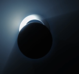
The style is also extremely interesting as the light is almost emerging from behind the black circle like a flashlight, which I feel is not only unusual visually but also adheres to the thriller/crime genre of our trailer. Many companies, such as 'Alliance Films' who produce the sort of film we are looking to recreate employ an ident that follows a similar style to the 'Entertainment One' logo seen above/below:
Although I am fond of the movement of 'Entertainment One's' ident, I don't particularly like the finished logo and have been more strongly influenced by the end logo of 'Impact Pictures'. The colouring and choice of positioning for the titles is much more interesting and unusual and so I would like to use samples from both idents in order to make my own:
However, after much of my time spent on motion attempting to create an ident that was similar to our influences, we managed to make something, which was fairly similar but which we did not particularly like. We thus decided to go down a different route and actually link both the logo/moving image to the word, 'Encrypted'. Despite the initial failure of the ident here, the experience was still extremely useful for me as it allowed me to familiarise myself with Motion, in which I was not confident on before-hand. I am now much more confident when using it, which has been helpful. Below is the first Ident we made, which we are not happy with. We had the idea of closing the gap between the 'Encrypted Entertainment' and the circle in the middle but after some time spent on it, I couldn't manage to make something I liked enough to use as our finished Ident and so we decided to scrap this idea as a whole and use it as experience if not anything else.
Motion was something we used last year for the AS course but was still something I was unfamiliar with and so I decided to take on this task in order to improve my skills on the technology. Despite the fact that the above Ident failed to work how I imagined it, I was still pleased with my overall work and confidence gain on motion, which was invaluable for the editing stage of our films.
-
Using original working title 'Gamechanger Films':
An Ident idea which I made in order to make the introduction to our trailer
slightly more professional is that Gamechanger Films. With inspirations coming
from companies such as 20th Century Fox and Lionsgate, shown right, we eventually
chose a mixture of the clean font of Columbia and the clean black background of
Universal as the main inspirations. This led us to choosing a font, a design and
whether there was going to be anything in the background. The layer order,
final design, font set up and effects used can be seen in the Photoshop screen
grab below.

Then came the animation, using Sony Vegas, to mix up the software from the
previous ident using Motion, we took this idea of encoding from Encrypted entertainment
and carried it over. Utilization of the TV simulator effect, as well as ready made effects
used in motion and light flares allowed us to create an ident which both looks clean,
professional, and resembles one usually seen professionally. It can be seen below.
Sound may still be added, however a silent ident at the start of a tense film, if done
correctly, has a majorly positive impact on the first act.
JL
MT


No comments:
Post a Comment