The above photos show that Joe can inhabit a casual or formal look and not appear uncomfortable or out of place. This is useful for a character whom we have yet to pin down a costume for, and could in fact be in either sort of clothing.
CM


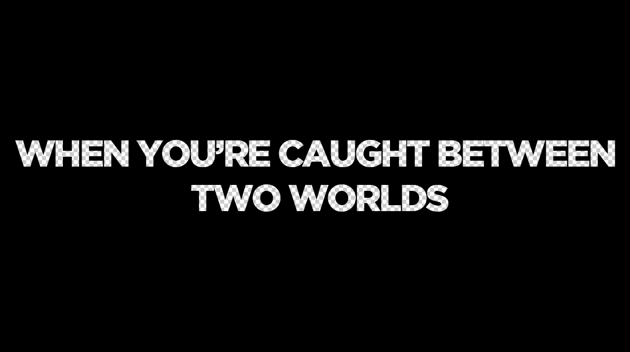
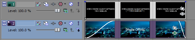
 ours, as was the film itself. The blue on black which is shown so much within the trailer is reflected within the narrative graphics, showing phrases which enhance the narrative along with the colours used, bearing connotations of big city life and mainstream films. The graphics use a blacked out png file with transparent text in the middle which is then placed in to a video editing software, overlaying the png on top of a moving/animated still of a city which has effects added to it. There are then multiple light and smoke layers placed on top of the black screen, which connote mystery and add to the aesthetic effect of the graphics. There is a slight reflection of the text in certain areas of the blacked out background which shadow the moving image which animates the graphics, and the words get closer to the foreground of the screen as they go on. This highlights their importance as well as emphasising the technical skill needed to make it, bring the audience closer to the animated background and smoke overlays.
 Only God Forgives - These narrative graphics are similar to Welcome to The Punch in their use of colour to bear connotations of the film, as well as their use to enhance the storyline. Apart from this, however, there is not much similarity at all. The use of dark red/neon colours throughout the film is reflected within these narrative graphics, connoting danger, lust, death and love. These are shown within the shots in the film, however the Oriental feel really comes out within the first two narrative graphics especially, showing these neon style text segments overlaying a traditional Samurai pattern on a paper wall. The final narrative graphics, which introduce the actors, don't replicate this use of traditional oriental design in the background and as such suggest something concerning the film, a sort of out of place-ness. The director is also introduced within the graphics, labelling himself as "Visionary"and referencing previous films he has done, of which Drive is his most famous. The fell of the graphics are very similar to the tone of drive, which can be seen later in the post, and as such builds up a fan base of stylised high budget crime thrillers. As previously, the text and background image come towards the audience, bringing them in to the film and increasing appreciation of the style of the film.
 Hummingbird - The graphics within Hummingbird are very different to the previous two examples/influence. They prefer a clean and easily readable style which again connote things which are going to happen but are done much more plainly, perhaps referencing the lower class/dangerous background in comparison to the previous two examples. The text is a sans-serif font with an outer glow and written entirely in capitols on a black background, again utilising smoke and light overlays to stop the graphic looking completely plain. The fragmentation of the words, as can be seen in the first example, bears reference to the main characters past and in hindsight is a quirky and interesting touch on behalf of the director, which only the active audience members ail pick out. This is reflected within the fact that the text is not centred on the screen and enforced through the shots shown prior to and post-graphic, leading the audience to experience a complete feel for the film as something more than just a mindless Jason Statham action movie. As the pace of the film picks up, the overlays on the background become more and more vivid and the text becomes bolder and with a greater glow radius, showing how what is says is becoming more and more important.
 Drive - These graphics are the most different from the previous three examples. Instead of being overlaid on top of a black background which has some form of effect on it they are overlaid on a panning ariel shot of the city. This would imply, along with the simplistic font and slight effects on the text, that what they are saying is more important than the connotations of knowledge of the city and sense of direction which come through. The reference to the actors Ryan Gosling and Carey Mulligan are therefore implied to be the films best selling points, along with the strong narrative which is established and the stylised and slightly Only God Forgives-esque neon/city feel. Because of this simplicity there is less to talk about due to the majority of the narrative telling being done within actual shots, and as such are not so much influences, but an option which we may be able to consider. We will probably not use this design however, as due to our lesser film making abilities, require the narrative graphics in order to enhance the narrative to a similar extent than our shots do.